CORE SERVICES
Education Identity
Hackney’s education service came back in-house from the Learning Trust in 2012, and since then has carried the Hackney Learning Trust brand throughout a transition period back into the management structure of the Council.
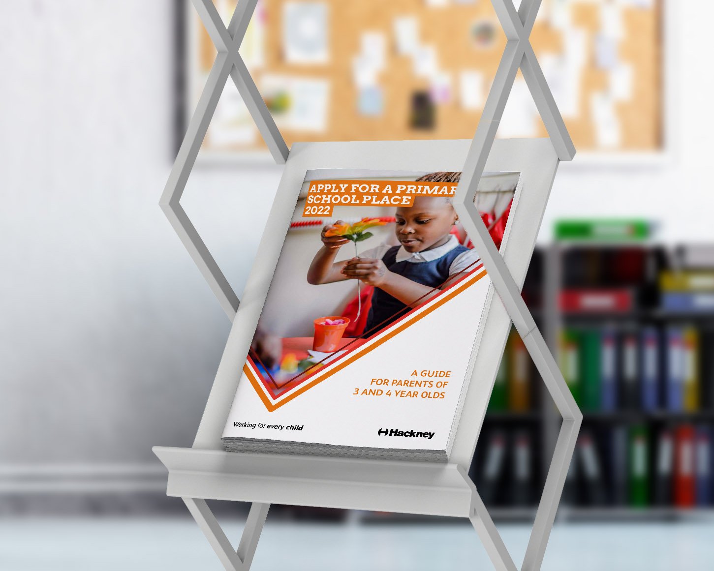
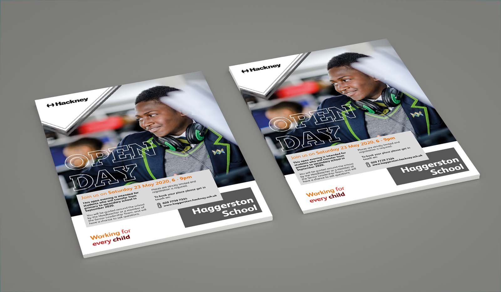
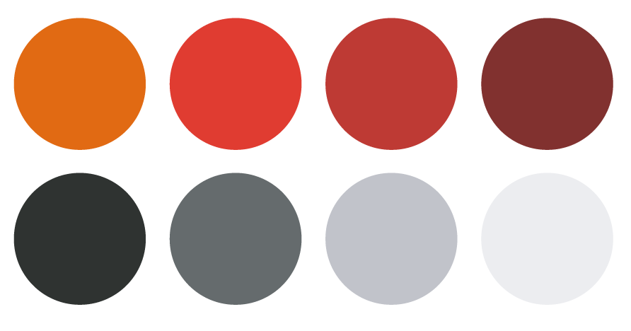
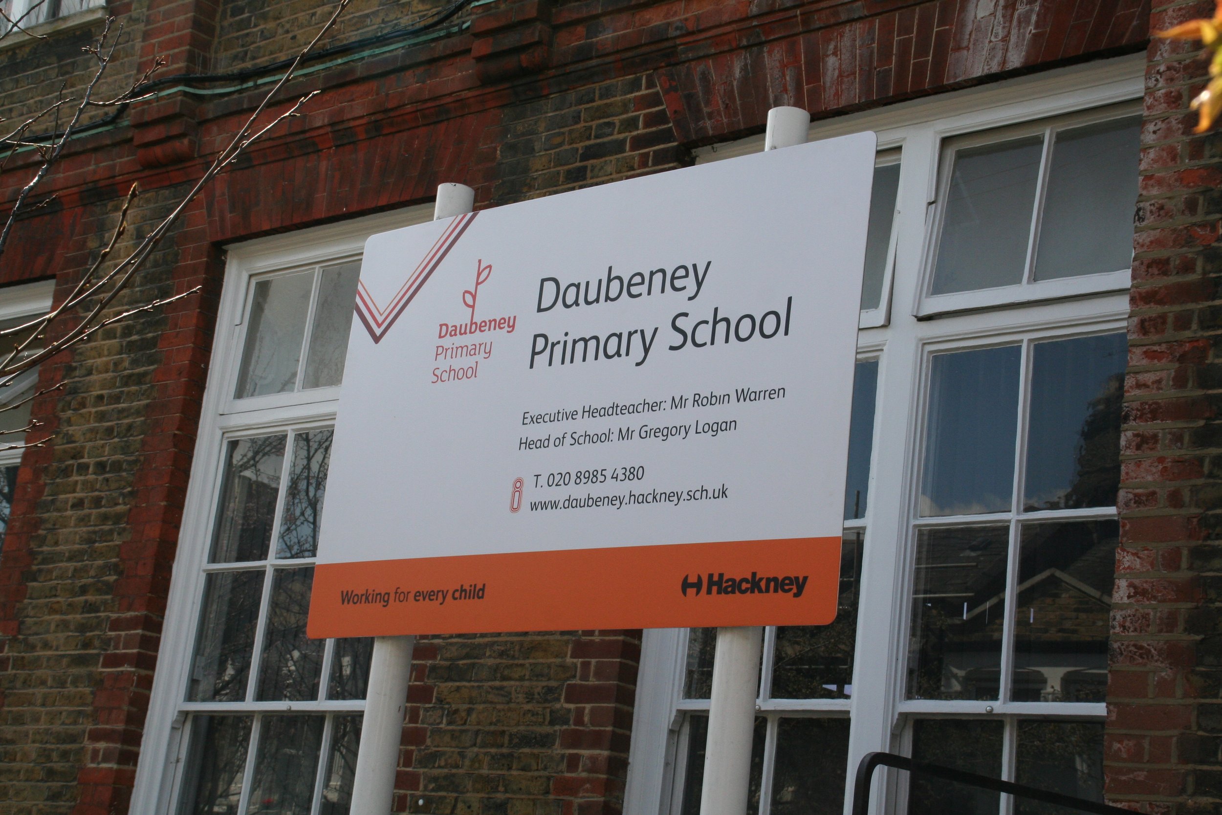
A further update to the sub brand in 2018 marked a closer integration between the education service and the rest of the authority and sees the Hackney Learning Trust brand being replaced with full council branding, using an orange and grey colour palette which provides a visual reference to the former Learning Trust, and a tick-shaped section of the supergraphic to denote success.
We have created an additional cross cutting strapline ‘Working for Every Child’ which is shared with Children and Family Services to create a sense of common purpose, collaboration and delivery.
Children and Family Services: Working for Every Child


Identity
The tick is essentially Education’s sub-brand. The graphic element that gives Hackney Education it’s identity.
The tick has always been synonymous with Education and also has positive connotations, so it is an ideal element to use in this instance.
Any variation of the G Palette supergraphic or grey can be used for Education communications.
Colour Palettes
The Strapline
The ‘Tick’ Supergraphic
Supergraphic origin
Supergraphic Variations
Strapline Variations
1 deck
2 deck
Typography
ARVO and ARVO BOLD is the font is to be used for any headers, titles, and any other higlighted text. Top tier headers should always be capitalised.
Where possbile ARVO is used with a block effect behind any titles.


